
In this case study
Seeking help should not begin with more uncertainty.
Felicity’s brief described mental-health stigma, limited awareness, access barriers, and language differences as obstacles to seeking support. The platform aimed to connect people with therapists through online counselling, with access across mobile and web.
The design challenge was to make the journey understandable: introduce the service, understand what someone is looking for, help them choose a therapist, and make scheduling straightforward.
For someone seeking support
Uncertainty about therapy, language, and availability can make the first step harder to take.
For the product experience
Discovery, therapist information, and scheduling need to form an understandable path across mobile and web.
The design challenge
How might we help people express what they need, choose a therapist, and understand the next step toward a session?
Understand the concerns behind the first step.
The research plan covered experience with therapy, awareness of online support, mental-health challenges, privacy and security, communication preferences, therapist preferences, affordability, accessibility, and progress tracking.
The competitor analysis reviewed mobile and website availability, community, journaling, therapist search, detailed profiles, and language selection. These were research topics and comparison criteria; the supplied deck does not provide participant counts or a quantified ranking of findings.
| Concern in the project material | Design response |
|---|---|
| People have different needs and therapist preferences. | Use a questionnaire to inform therapist discovery. |
| Language can limit access. | Make languages spoken visible on therapist cards and profiles. |
| Appointments need to fit everyday schedules. | Let users select an available date and time. |
| Support extends beyond booked sessions. | Include guided meditation, journaling, and self-care resources. |
Three decisions, visible in the product.
Give people a way to say what they need.
The questionnaire lets people select areas they want to focus on. The project describes using these responses to support therapist matching, helping connect an individual’s concerns with the next step in the experience.
- Design rationale
- Give people a structured way to express their areas of focus before exploring therapist options.
- Tradeoff
- Personalization adds questions before discovery. The purpose of those questions should be understandable.
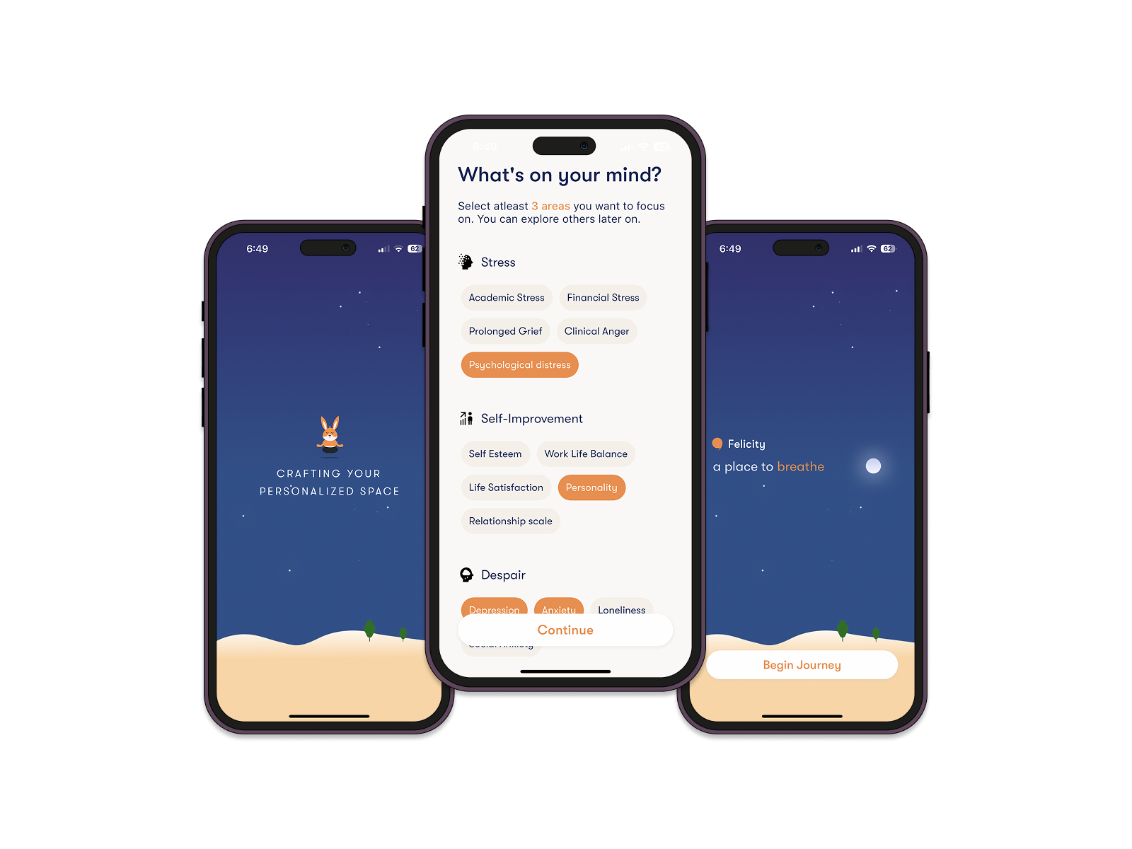
Give people a way to say what they need.
Welcome, focus-area selection, and personalization screens.
Make therapist information easy to compare.
Therapist cards and profiles surface qualifications, languages spoken, availability, and areas of specialization. Search and filtering support discovery, while profile details let a person learn more before booking.
- Design rationale
- Make qualifications, languages, specialization, and availability visible when comparing therapists.
- Tradeoff
- Detailed profiles support choice but can become dense. Essential decision information needs a clear hierarchy.
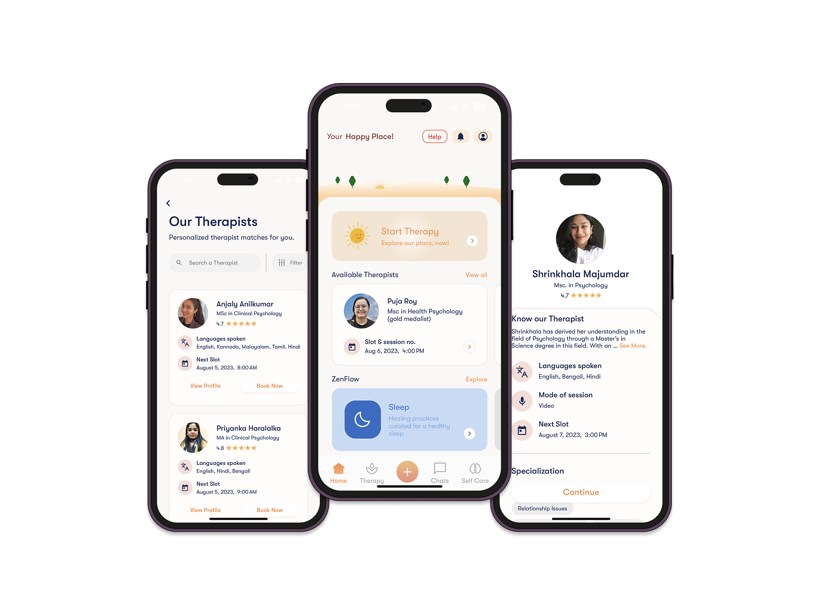
Make therapist information easy to compare.
Therapist listings and profiles show languages, qualifications, and available slots.
Keep scheduling close to the therapist.
The booking flow keeps therapist information visible as the user chooses a date and time. The supplied designs also show the video-session interface, connecting selection, scheduling, and the session experience.
- Design rationale
- Keep the selected therapist visible while choosing a date and time so the booking remains grounded in that choice.
- Tradeoff
- Combining profile context and scheduling adds information to the screen; the selected slot and next action need to stay clear.
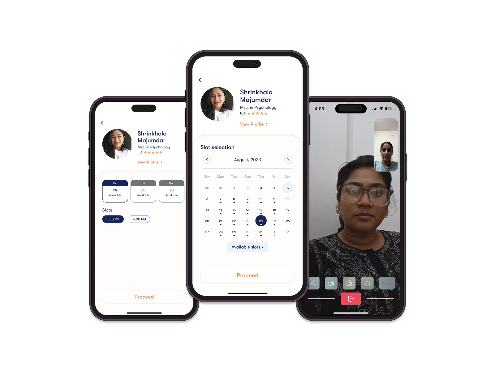
Keep scheduling close to the therapist.
Date selection, available time slots, and the video-session interface.
Support before, during, and between sessions.
- 01Share your needs
- 02Find a therapist
- 03Book a session
- 04Explore self-care
The broader product direction brings counselling together with self-care. The deck describes meditation, a private writing space, and community support as parts of the experience.
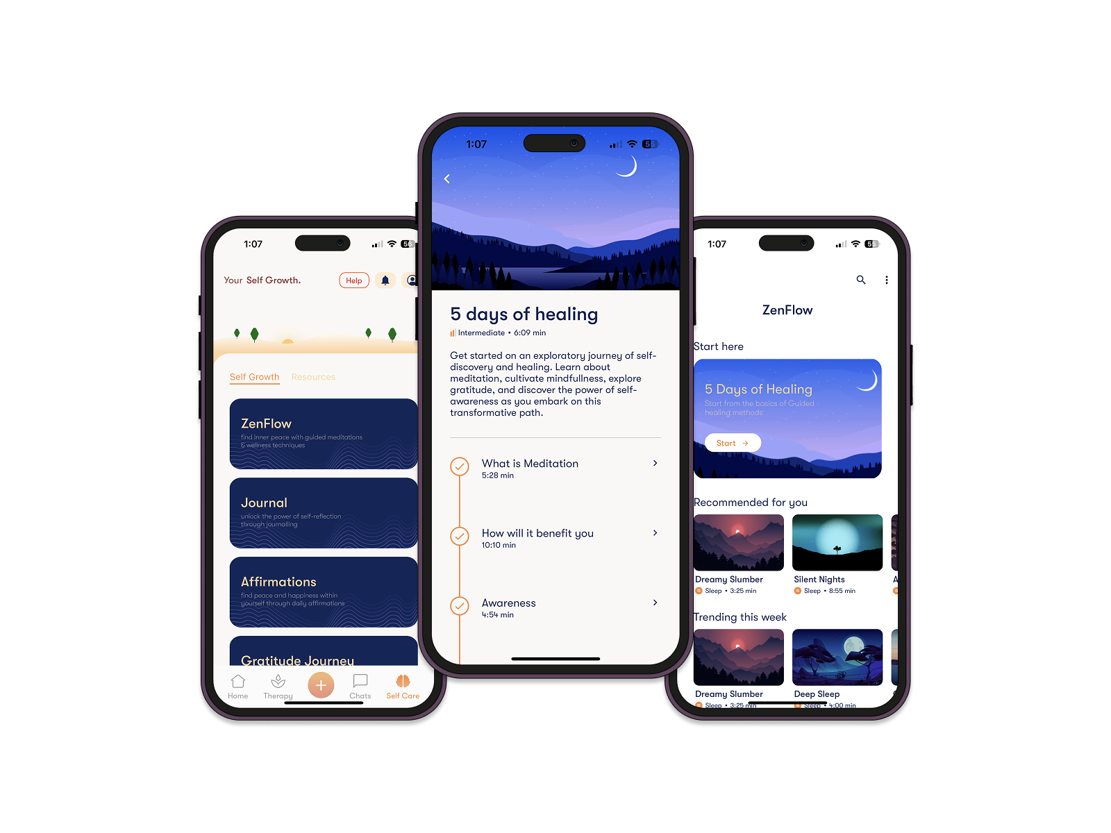
Make space for an ongoing routine.
Self-care categories, a guided meditation course, and the ZenFlow content library.
Discover support
Onboarding introduces the service; a questionnaire helps establish personal areas of focus.
Choose and schedule
Therapist information and available slots support selection and booking.
Access a session
The supplied material describes online chat and video counselling, with a video interface shown in the designs.
Explore self-care
Meditation, journaling, and related resources extend the experience beyond appointments.
Keep design evidence separate from clinical outcomes.
The supplied case study documents the research topics, intended solution, and product screens. Its conclusion describes positive user feedback, but does not include a study protocol, participant-level findings, or measured outcomes.
These screens demonstrate the proposed user experience. They do not establish clinical effectiveness or independently verify privacy and security protections.
These are proposed checks, not reported test results.
What the next validation round should establish
Proposed tasks and success signals for a future evaluation; these are not completed test results.
| Scenario to evaluate | Success signal |
|---|---|
| A person completes the focus-area questionnaire. | They understand why the information is requested and how it relates to therapist discovery. |
| A person needs a therapist who speaks their language and fits their schedule. | They can identify a suitable profile and find an available slot. |
| A person moves from booking to self-care content. | They can distinguish their appointment details from optional resources between sessions. |
A connected path from a concern to support.
The design brings onboarding, therapist discovery, appointment booking, and self-care into one product experience across mobile and web. The intended benefit is to reduce friction in finding and accessing support.
Design takeaway
Clarity matters at each step: expressing a need, understanding a therapist’s profile, choosing a time, and knowing what happens next. The case study centers on making those choices visible and approachable.
Adapted from the supplied Felicity case study and product images. No conversion metrics, clinical results, or launch outcomes have been added.
What I take forward
Make choices easier to understand.
Clear profiles and scheduling reduce uncertainty in the interface without making promises about clinical outcomes.
Validate expectations as well as navigation.
Future evaluation should examine what people believe matching, booking, and self-care will provide.